 Each one of my projects gets a font, to dress it up and give a certain visual consistency. I have chosen the Crom font for Axes and Anvils. It is free to use commercially, and I think it meets the requirements.
The font must be legible, convey a feel for the project, and have some style. Here it is. What do you think?
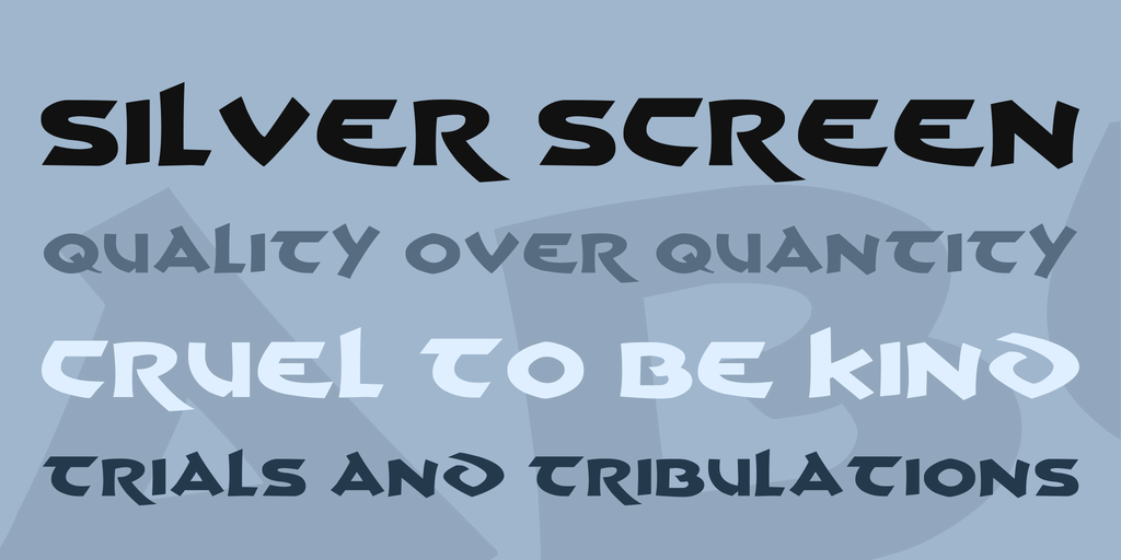 The font does not differentiate between capital and lower case letters, and there is no punctuation, but I think it will work fine for headings and titles.

Very nice!
LikeLike
Looks good!
LikeLike